Recent Updates Toggle Comment Threads | Keyboard Shortcuts

  • Victor 7:53 pm on April 13, 2019 Permalink | Reply
    Tags: , Optimal transport, Time series analysis   

    Wasserstein distance vs Dynamic Time Warping 

    In my internship with UCSF Neuroscape lab, I was faced with an important question: is there any difference between Dynamic Time Warping and the Wasserstein metric applied on one-dimensional (time series) data? The end-goal here is to find an algorithm that could reliably determine how similar the body motion of an older adult is to young adults, but this question of DTW vs. Wasserstein applies to all time series comparison problems.

    Background

    Time series data is everywhere: stock information, temperature graphed over hours, and video are all time series, as they all are a series of data points linked in time order. For stocks, the price points of each day are linked; the temperature of each hour is stringed together; individual frames are linked together chronologically to form videos.

    Dynamic Time Warping, an algorithm that uses dynamic programming, had been a leading time-series analysis algorithm for several decades, being used in a wide array of applications. As the name suggests, DTW “warps” the time coordinates of the time series in order to see similarities, even if the two series are not entirely aligned – a very useful trait.

    However, another family of algorithms have just popped up – Optimal Transport. In the recent years, OT, and especially its Wasserstein distance, have become incredibly hot in Machine Learning, finding itself employed in roles from image searching to the discriminator of Generative Adversarial Networks.

    Although Wasserstein distance (also called EMD) is nearly exclusively mentioned in the context of ML topics, when applied on time series data, it has an effect incredibly similar to that of DTW, also diligently warping coordinates to find similarities between series.

    All of this begs a question – exactly how similar are Dynamic Time Warping and ML’s Wasserstein metric?

    Through looking into the two algorithms and performing real life testing, we find that DTW is nearly a 1-dimensional special case of Wasserstein metric, but is different in two ways.

    Dynamic Time Warping

    Dynamic Time Warping is a wonderfully simple algorithm, utilizing a two-dimensional array for the entire computation. Each state is the minimum of three possible cases: advance, insertion, or deletion, and the final cell of the array is the answer. Python code for DTW is incredibly simple, as seen below:

    The line containing the “min” operation is the crucial status update

    Wasserstein Metric

    The Wasserstein metric is a much more general method, being able to compare the similarity of two arbitrary probability distributions, not just time series (data organized on one dimension).

    The core concept here is transportation: how costly is it to change one probability distribution, so it becomes the other distribution? The more costly this transformation is, the less similar the two distributions are.

    Being a far more general algorithm, solving for the Wasserstein metric is a much more complex process, a representative solution being the Sinkhorn algorithm.

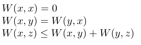
    A key difference: metric

    Crucially, DTW is not a metric, because it does not always satisfy the triangle inequality. In mathematical language, it means that the following isn’t always true:

    The Wasserstein metric, being a metric, satisfies all these conditions:

    Wasserstein being a metric can be a major advantage in some scenarios. However, this isn’t the only difference between the two.

    Chronological matching

    Although DTW and Wasserstein metric have very similar effects on comparing time series, they come from different perspectives. DTW assumes that two time series being compared are of the same order, just with some segments compressed/expanded, and therefore employs dynamic programming to negate these compressions/expansions, while keeping the order of the series intact.

    The Wasserstein meric, however, comes from a transportation perspective: the time series data is simply treated as a collection of each time-frame, and when transforming the time series, its frames do not have to be kept in order at all.

    For example, if we take a video of 10 frames, A, and reverse the order of the frames to form video B, DTW and Wasserstein would produce very different results.

    DTW would find series A and B to be not similar at all, as no amount of compressing/expanding parts of A will make it into B, since the frames are fundamentally out of order.

    However, Wasserstein would find A and B to be identical, as each frame in A has a completely identical twin in B, so A can be turned into B without changing any of the frames at all.

    (Note that here we are not specifying the ground metric, which is the measure used to determine how similar two individual frames are. No matter what the choice of ground metric is, the difference between DTW and Wasserstein remains.)

    Of course, this is an extreme example, and in real world scenarios, the two methods often agree quite well, as the following experiment shows.

    Applying on body motion data

    Going back to the UCSF problem, we would like to compare two segments of body motion and output a similarity value.

    Of course, would like to the comparison to detect similarities even if there are relative speed differences: if two motions are otherwise identical, but one is twice the speed of the other, we would still like the similarity to be high. Therefore, I turned to DTW and Wasserstein for help.

    In a sample experiment, I used four “groups” of body motion segments, comparing segments in each group against one another using the two methods, and the results are visibly very similar. Here, (n,m) in a heatmap is the distance between segment n and segment m, as measured by DTW (left) and Wasserstein (right).

    The r-value between the DTW distance and the Wasserstein distance is an incredible 0.98 out of 1, indicating a very strong correlation between these two distances.

    There are indeed very minute differences between the distances calculated by the two, which could be attributed to the chronological matching difference as described before.

    Conclusion

    Through testing on body-motion data, we confirm that DTW is very nearly a time-series (one-dimensional) special case of the Wasserstein metric, but there are two key differences separating the two:

    Metric: DTW does not always satisfy the triangle inequality, but Wasserstein maintains this inequality faithfully

    Chronological matching: DTW maintains the order of time series when conducting comparisons, while Wasserstein freely changes the order in search of a more efficient transformation.

     
  • Victor 10:04 pm on September 12, 2018 Permalink | Reply  

    Rice cooker rant 

    The strange situation surrounding the versatile rice-cooker had just occurred to me. To make rice, I add rice, rinse the rice, add the water, and then dip my finger into the mix to adjust the ratio of rice to water, a surprisingly difficult task. The rice tends to distribute unevenly around the pot, so only sampling the depth of the water at one area may be very inaccurate. Typically, the rice has to be swished around in the pot, and multiple samples have to be taken, in order to decrease the ever-so-large standard deviation. I have the honor of being the sole rice-maker in my family, as I am quite good at employing various techniques to make the final mix very near the magical balance. However, even my skills cannot conquer the unenviable and infrequent task of making porridge, and the final product, despite my best efforts, is generally a slurry with viciousness lodged somewhere near that of half-melted ice cream.

    And all of that begs a very important question: in the prosperity of the 21st century, when possibly billions of people use rice cookers, why are we still adjusting everything by hand? How hard can it be to have the rice-cooker dispense the exact right amount of both substances, so people can reliably enjoy a perfect bowl of rice? If not for college apps, I’d love to make such a rice cooker, just to prove that some innovations are genuinely hidden in plain sight.

     
  • Victor 6:51 pm on September 4, 2018 Permalink | Reply  

    Scam detection for online shopping 

    Are major online shopping platforms like Amazon and Ali automatically detecting scammy-looking products using machine learning? If not, this could be a nice opportunity.

    Scams often leave relatively obvious traces, and a good classifier that combines Natural Language Processing (LSTM or attention model), images (CNN), and price should be able to filter out scammy products with decent accuracy. A notable difficulty would be constructing an accurate training dataset, as labeling each example as either scam or not can be expensive, but the effort should be worth it, considering how rampant scams are.

    On the business side, online shopping platforms can put a ‘risky’ label on all the scammy products, urging the seller to make a more truthful description or risk losing sales. This would not damage the volume of trading at all, and can make the platform much more healthy.

    *To clarify, the ‘scammy products’ mentioned here are those with descriptions that may be dishonest

     
  • Victor 11:54 pm on August 28, 2018 Permalink | Reply  

    Graphing calculators: where legacy tech lives on 

    Today I came across an incredibly interesting fact: graphing calculators often use processors from the 1970s and 1980s. The TI-84 series uses the Zilog Z80, which powered some of the earliest home computers, the Casio fx-9750, which happens to be what I use, appears to have a variation of the Motorola 6809, and the TI-89 gets the Motorola 68000, the processor of the original Macintosh, among many other computers in the 1980s.

    I’m very pleasantly surprised. I expected the calculators to have more modern processors, but on another thought this makes sense, because many of these calculators were designed in the 1990s, and the additional compatibility of older chips can really made development of and programming on the calculators easier.

     
  • Victor 11:09 pm on August 26, 2018 Permalink | Reply  

    Universal internal connector 

    The world might need an universal flex-cable connector for internal electronics use. (Essentially, an internal, miniaturized version of the venerable USB) The connector should be designed to accommodate many functions, such as connecting the battery, camera, WLAN modules, GPS, and so on. An associated set of protocols would certainly need to be developed, analogous to the hardware-software cooperation in the case of the USB standard. This is because current internal connectors are merely designed for a specific purpose, so creators often have to resort to bulky external connectors, such as the USB, for internal functions.  These bulky connectors and the associated cables greatly hinders the development of compact DIY/prototype devices. A universal internal connector would enable much more compact DIY and low-cost prototype devices to be built, helping to unleash the potential of future 3D printing technologies.

    Meanwhile, such an connector could also enable electronics manufacturers to save budget, as they are currently developing proprietary flex-cable connections for trivial, non-performance-intensive things, such as connecting the battery, fingerprint sensor, speakers, and so on. (As far as I know) Obviously, big companies may need many proprietary features and are generally too arrogant and exclusive to consider universal solutions, but smaller companies may very well need the savings.

    Of course, such a large-scale universal connector would be very hard to develop and market without the support of large companies and a widespread, obvious need from the market, so such a connector might not materialize in the very near future, unless the aforementioned drawbacks of current solutions really start to show in the business world. However, scaled-down and relatively intra-platform versions of this connector could start appearing soon. Raspberry Pi, for example, is incredibly popular, yet currently rely on the bulky and weak GPIO pins for many functions, and 2 dedicated flex cables for the official camera and display. It could be very much in the foundation’s interest to put a type of ‘universal raspberry connector’ on the board, accompanied by a set of software protocols, and encourage the development of various modules that use this connector. If this does happen, the wider industry’s reaction could be interesting.

     
  • Victor 10:09 pm on August 22, 2018 Permalink | Reply  

    Tesla’s situation as an investor 

    Recently Tesla’s situation had become incredibly interesting.

    Elon Musk seems to be unique in that he is never content with lying in the couch and watching the money flow in, and that is the worst thing from a stocks trader’s perspective.

    Traditionally, tech-related entrepreneurs make a ground-breaking innovation, dominate the market, and then lie down to comfortably profit, (and the stocks go up) while spending some cash on relatively conservative and safe developmental work. Facebook, Amazon, Google, and many others have all more or less followed this path. Mr. Zuckerberg is only around 30 years old, but he’s perfectly happy with lying down and making money while squashing late-comers – and in my opinion that’s a big reason why money feels safe in the form of Facebook stock.

    Meanwhile, Elon Musk seems determined to blow every penny into radical developments. With no imminent competition in sight, Tesla simply isn’t happy with giving its two existing, successful models occasional upgrades and catering them to the rich, and instead had chosen to start the incredibly risky Model 3 project, which had so far proven financially challenging. It would almost appear that Elon Musk enjoyed being on the brink of bankruptcy.

    On the other hand, though, Elon Musk had built a nearly unbeatable cultural advantage. With various scandals (or near-scandals) popping out of so many established tech companies, Elon Musk remains the friendly, courageous, innocent, and innovative entrepreneur that he had always been, and I’d say that nobody wants to see him fail. Such a cultural air-curtain could potentially be game-changing, and could be putting a much needed layer of safety on Tesla’s stock.

    Can’t wait to see what Tesla’s future looks like.

     
  • Victor 11:55 pm on August 16, 2018 Permalink | Reply  

    Ukulele overlaying 

    So I picked up the Ukulele a few days ago, and so far it’s been a blast. The Ukulele had nearly been as easy to learn as promised, with simple songs coming together nicely with a few days of practice, and ergonomic issues (finger-related) fading into the background after the first day or two. Anyways, I started seeing songs that required ‘two Ukuleles’, one playing the main track and the other playing the background track. Not having two of these instruments, it seemed that these songs will have to be incomplete.

    However, a thought soon appeared: I can record the background track first and play to it. The instant I had this idea, I knew I had to do it, because it was so wild and nasty that it was intensely good. Minutes later, I had the background track flowing out of my phone speaker, the quality broken as ever but the content still preserved, and after playing the main track to it, I can’t help but laugh: this is probably as organic as fun gets.

     
  • Victor 10:47 pm on July 6, 2018 Permalink | Reply  

    Blur detector 

    Many people (me included) prefer to take duplicate photos out of fear that some of them may be blurry, and choosing among these duplicate photos takes considerable time afterwards. This problem stems from the fact that, even though smarphones today do a great job of avoiding blurry shots, they do not tell the user when a blurry shot is taken. In this case, a software feature that warns the user to take another shot when the previous one was blurry would save a lot of time. I’m honestly surprised that this feature is not on any major phone yet, considering how easy blur detection is to implement. Looking forward to this feature showing up on the phone of an aggressive brand, say, OnePlus.

     
  • Victor 11:05 pm on July 4, 2018 Permalink | Reply  

    Reviewing the websites of universities 

    Why?

    Upon looking at the websites of various universities, I was amazed by how different they are to each other, and how the website of each university was closely entangled with its culture. Therefore, I wrote this document to give my two cents on the websites I’ve seen so far.

    Scoring

    The overall score of each website seeks to give an accurate general impression of how good it is, primarily from the perspective of applicants. As such, the score is given holistically, (yes, if universities review me holistically, I’m happy to return the favor 🙂 ) mainly based on the following 3 factors, ranked by importance: functionality, style, and refinement.

    Functionality: how easy is it to find key information, such as EA/Regular deadlines, super-scoring policy, campus visit registration, and admissions platform?

    Style: is the website pleasing to look at? Does it create a unique feel and atmosphere?

    Refinement: do the details reflect that careful thought and design was put into the website?

    Bring it on!

    Caltech

    Overall score: 4/5

    Clean and functional, there is not much to dislike about caltech.edu. Most content pages employ a consistent text-centric style, effectively conveying information with concise language. The result is that retrieving crucial information such as application guidelines and facts on Caltech is a pleasure, and the user leaves with not only what he came for, but also a humble and down-to-earth impression of the website, as the language is written in a clear, brag-free manner. The navigation pages are a rare blend between style and functionality, with each link consistently being represented by a refreshing but not oversized image. The clear differentiation between the information and navigation pages, consistent and mature styles, and well-written language all display great design, earning a solid score of 4/5.

    CMU

    Overall score: 1.5/5

    CMU’s primary website is a decent mix between function and style, but the dedicated undergraduate admissions sub-site is such a train wreck that any good score is instantly rendered impossible.

    Cmu.edu itself is a fine if not exceptional website, offering users with a stylish but not obnoxious UI, an admirable amount of useful information, and even a unique “browser” sidebar that makes navigation a little easier. Add a dreaded “admission.enrollment.” at the front of the url, though, the site seemingly morphs from a classy, reasonable receptionist into a thuggish teenager that hasn’t figured out what he wants to be yet.

    Each page on the admissions site is dominated by an over-sized navbar and much visual clutter, and the information that does make it to the screen is displayed in unreasonably large print for more than 90% of the screen width, which is incredibly inconvenient to read. (Analyzing the HTML shows that the width is in fact often not defined at all; the text spans across the entire screen except for narrow paddings on the sides) The visual elements on the website are some of the most sharp and modern I’ve ever seen on an university website, but the design of these are far too generic: the visual elements are not styled to fit the university, and would make perfect sense decorating, say, the website of a tech company. The fact that CMU is known for its Scottish heritage makes the design all the more unforgivable: why was there not even a speck of tartan on the website? It almost appears as though the sub-site was constructed without the oversight of a chief designer, leading to a design lacking in direction and cohesion.

    Columbia University

    Overall score: 3.5/5

    A solid performer, Columbia’s website delivers a classy interface without detracting too much from functionality. However, this site is yet another victim of the ‘dedicated admissions site gone wrong’ epidemic that appears to be going around as of now, the less-than-polished admissions sub-site lowering the score from 4 to 3.5.

    Columbia.edu is a great compromise between style and functionality. Its simple and classy royal-blue theme is supplemented by some detailed photos for a visually appealing website, while the visual elements do not hesitate to make way for actual material once the visitor scrolls down a little. However, the dedicated undergraduate admissions page does not live up to that first impression. Strangely (and uniquely), the sub-site is visibly less decorated than the main site, the navbar area being especially disappointing. However, the sub-site does redeem itself in that accessing crucial information is fairly straightforward, finalizing a decent score of 3.5/5.

    MIT

    Overall score: 5/5

    Fantastic! In an age when nearly all universities go out of their way to stuff their websites with over-sized images and ivy-reminiscent descriptions, the engineering giant reminds users what a clean, fresh, and functional site can accomplish.

    Since MIT is our highest scorer here, I’m going to spend a bit more time detailing the review.

    Venturing onto mit.edu, the site that pops up may seem a little messy at first, but after using the interface for a while, one will start to appreciate how easy it is to access crucial information.

    To start with, the site has a very logical top-down organization, with each page containing an overview of the topic it covers and logical, well organized links to sub-pages that explain things in greater detail. Sub-pages almost never go outside the context set by its ‘parent’ page and rarely overlap in information with each other, making accessing a piece of information straight-forward and simple. Also, there is virtually no advertising (by this I mean things like student/faculty ratio, student diversity, and how many majors are available……) to get in the way, because MIT is one of very few (if not the only) top schools with the consciousness to realize that it doesn’t need advertising (!!).

    The logical organization is further supplemented by the non-intrusive styling employed here. Screen-filling images that get in the way of navigation and information are all but gone, the site instead choosing to employ smaller, more user-friendly methods of decoration, such as the multi-colored ribbon on the top of admissions pages, vibrant colors on buttons, and smaller images scattered onto certain areas. The result is that navigation links and buttons are incredibly easy to access,

    As a whole, MIT’s website is coherent and well thought-out, the careful design work manifesting itself in many details (why is MIT the only school, to my knowledge, to offer a printable campus map on the campus visit page?! how come most other schools don’t give a chart with all notable admissions policies in one place?!). Avoiding fancy advertising and adopting a functional, no-nonsense style instead, MIT had firmly distinguished itself from its less established counterparts (and some equally established ones too!).

    GIT

    Overall score: 4/5

    Gatech.edu is well-made in every aspect. Accessing information on admissions and academics could be easier, as information is sometimes a little too spread out and requires many tabs to navigate, but the process is far from frustrating. Meanwhile, the website maintains a very consistent and pleasing style, which includes a simple, clear design trend, the bee mascot (named ‘buzz’), and the distinctive yellow-black color theme. Refinement is also great, as the site does not have any “weird habits” that frustrates the user, such as sluggish navbars, laggy scrolling, or simply an over-crowded layout. The all-rounder gets a solid score of 4/5.

    Harvard

    Overall score: 5/5

    Harvard had taken an admirable approach to their website, constructing a sensible all-rounder that displays some unique characteristics. Accessing information is reasonably convenient, the slightly complex navigation being easily forgiven due to the large amount of information the website has. Styling-wise, Harvard.edu manages to create a modern, advanced feel without hampering functionality at all, earning a well-deserved 5/5. (Details below)

    The styling of Harvard’s website stands out not only because it feels good, but also thanks to its non-intrusive approach that does not take points away in functionality. Key admissions information is clearly listed in one page, and department information never takes many clicks to reach. A key to this success seems to be the very cautious use of large pictures: the modern feel comes from nuanced fonts, innovative graphics, good layout, and diverse colors, subtle elements that add together to provide a compelling and non-intrusive styling package. The only complaint may be that the content pages are sometimes on the wordy side, with large paragraphs lacking consideration for those in a hurry.

    Stanford

    Overall score: 2/5

    Unfortunately, this research powerhouse in the heart of silicon valley does not have a world-class website, disappointing with a bloated and dysfunctional mess. Whatever points the styling brings in is completely overshadowed by the painful experience the website gives its visitors.

    At first glance, Stanford appears to have done a nice job, as visitors are greeted with a smooth UI and many beautiful graphics. However, there is little to love about stanford.edu aside from what first meets the eye, as it’s organized so that it takes many many clicks, much scrolling, and a shocking number of tabs to gather any useful information. If the website is a dumpling, then it’s one of those that’s got the meat hidden behind a huge wall of boring flour, which is truly a shame, considering the website actually contains a terrific amount of useful content buried under advertising material. Browsing on the site is just like taking one hopeful bite after another and still not reaching the tasty stuff. Perhaps Stanford had determined that only the students patient enough to dig all the way through the packaging deserve to learn about the school? (Taps temple) Looks like the webmasters have some work to do……

    USC

    Overall score: 3.5/5

    Another decent but unspectacular website. The main site is somewhat lacking in style, while the admissions sub-site sacrifices functionality but is gorgeous to look at. Interestingly, the main site, the admissions sub-site, and the sub-sites for each department have very different styles. Perhaps this is hinting that the departments have above-average autonomy? One can only guess.

    UPENN

    Overall score: 5/5

    UPENN teaches us what it means to have a ‘admissions sub-site done right’. Though navigation is slightly on the harder side, the content is organized in a fairly logical fashion, to the visitor’s convenience, and the truly unique styles makes admissions.upenn.edu stand out from the pack. The main site isn’t bad either, offering a wide array of information that can be accessed with reasonable ease.

    I’ll focus on the brilliant styling of the admissions sub-site here. To start with, the styling package is incredibly distinctive, drawing almost no parallels with any other school. The overarching theme is casual, laid-back, and deeply playful, greatly departing from the generic sharp, metropolitan theme that most schools utilize. This is evident in the website’s extensive use of handwritten/drawn elements, diagonal slashes, ‘double-layered’ labels, and large blocks of colors.

     
  • Victor 12:12 am on June 24, 2018 Permalink | Reply  

    The near future: optimized materials 

    As we all know, optimizing the shape of a certain material can drastically improve its weight efficiency, and most performance-oriented designs extensively use these optimized materials. However, they are far from ubiquitous, as less performance-oriented structures such as buildings and infrastructure still use standard, non-optimized beams of all sorts.

    I think this could change in the near future, as optimized materials can become as standard and easy-to-use as standard, solid beams. Standard one-size-fits-all optimization patterns (such as removing triangles from the size of box beams) can be pre-fabricated onto construction materials, making these optimized materials as convenient and standardized as conventional materials.

    A major challenge would be the interference of optimization patterns with fittings: what if a user needs to put a rivet in a position that had been cut through for efficiency? Generally, for beams the fittings are on the ends, so pre-fabricated optimized beams can come in standard lengths, with optimization patterns stopping shy of the ends so fittings can be installed. Other types of materials, such as sheet metals, may be harder to pre-fabricate, but with today’s automation technology, it may very well be economical to let robots stamp custom optimization patterns for each user. For example, a user could specify where the material must be free of optimization, and the robot can stamp triangles out of the material everywhere else.

    With potentially rising material costs and more structures that demand good material performance, optimized materials has a good chance of being standardized and becoming ubiquitous, so let’s wait and see.

     
c
Compose new post
j
Next post/Next comment
k
Previous post/Previous comment
r
Reply
e
Edit
o
Show/Hide comments
t
Go to top
l
Go to login
h
Show/Hide help
shift + esc
Cancel